Design a brand identity for the following: Bella Cucina
Authentic Italian Pasta 1lb package {pirate all information from an existing package}
Whole Italian Tomatoes 28 OZ can {pirate all information from an existing package}
Regional {for example, Tuscan} Olive Oil {pirate all information from an existing package}
In Bocca Al Lupo
Concept + Design by Amanda Andreucci
For this project, I was heavily influenced by Louise Fili, an expert in Italian visual design and culture. In bocca al lupo is a high-end Italian cooking brand that sells pastas, sauces, and olive oils. Whether you’re trying to cook up your favorite roman classic or try a new venetian recipe, In bocca al lupo is guaranteed to have the highest quality products that will make you feel like you’ve been dropped into the heart of Italy.
Bella Cucina
Concept + Design by Ben Ceccarelli
The set of 3 Italian products include tomato sauce, olive oil and pasta. I wanted my design to reflect rustic Sicily and in doing so I illustrated my labels accordingly with traditional garments and as an inspiration for the illustrations, referring back to vintage Italian travel posters.
Bella Cucina
Concept + Design by Grace Graves
In this project, I chose to bolster the customer’s connection with the brand “Bella Cucina” and its home region of Montebello, Italy by playing with creating a “founder” character and his donkey friend. I was inspired by an old photo that I found from the region to create these guys, and it was so fun to play with them interacting across the product line.
Bella Cucina
Concept + Design by Christa Jones
The pattern in this design was inspired by Italian floor tiles I saw briefly when I visited Italy, and that informed the rest of the design in typography and illustration choices. This pasta packaging follows the same style guidelines as the olive oil packaging. In order to distinguish the two designs, I made the packaging’s color blue. What separates the pasta packaging from the rest is the choice I made to include directions on the back of the box with small illustrations. I wanted to take the opportunity to not only make the design more inviting to the user, but also to showcase more illustrative elements for the design to show off. The typography and illustrative elements are consistent throughout the Bella Cucina packaging line, but the form of the packaging for the tomato sauce makes this design different. Due to the design being on a can, I had to simplify the amount of information that stood out, so nothing important would get lost.
Bella Cucina
Concept + Design by Sophia Mairowitz
For the assignment Bella Cucina, we were challenged to create an Italian line of olive oil, tomato sauce, and pasta. I decided to focus my brand on romanticizing the ingredients involved in traditional Italian cooking, while keeping the line modern and bright.
Bella Cucina
Concept + Design by Alli Mandel
Bella Cucina is a line of traditional Italian ingredients; farfalle pasta, olive oil, and canned tomatoes. My goal for the brand was to create a modern, yet classic Italian feel inspired by futurism: a design style that was popular in Italy during the 20th century. To complete the brand, I included illustrations of different ingredients, as well as a traditional Italian villa.
Bella Cucina
Concept + Design by Brian Morrissey
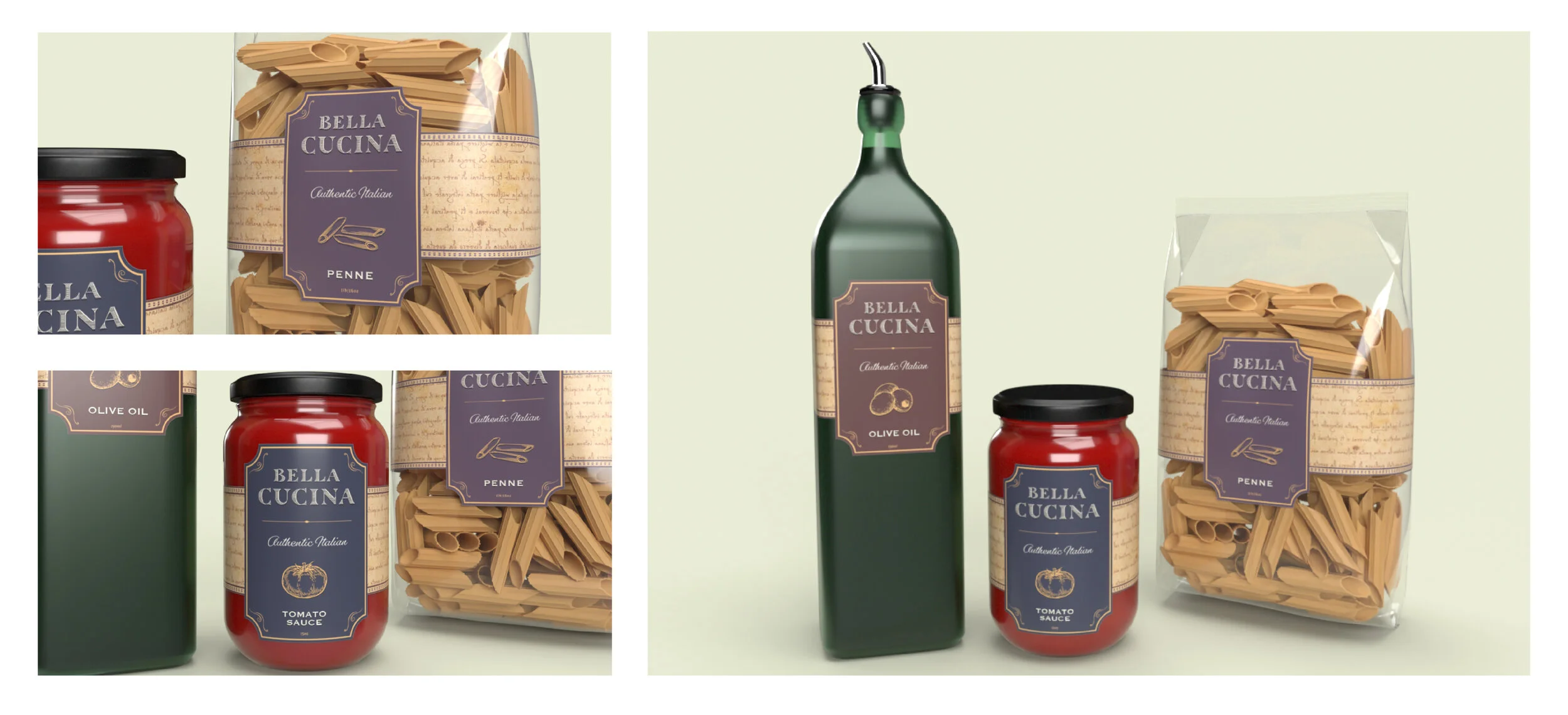
Bella Cucina is a brand that inspires families around the world to cook italian. The bands surrounding each product are inspired by Leonardo da Vinci’s writing and sketchbooks. The labels themselves are designed to feature the information about the product in an elegant italian style.
Bella Cucina
Concept + Design by Quyen Nghiem
This Bella Cucina packaging went through many multiple designs that at first focused mainly on illustration but eventually became something entirely different. The intent here was to create a more classical and elegant approach inspired by the work of Louise Fili.
Bella Cucina
Concept + Design by Justine Wollman
For this project, we had to create an Italian themed food packaging brand. We were restricted to only Italian asthetics, so this project required much research. I chose to base my packaging on Italian travel posters and women depicted in them. I wanted to create a flavorful yet still nostalgic with a limited bright color pallet. I also approached the type based on Italian restaurant signage.


