Reverse Engineering
by Hadley Leary
My research focuses on an undated trade card for Buckingham’s Dye for the Whiskers, a patent medicine product designed to return grey facial hair to its “natural” appearance. Popular in the late nineteenth century, trade cards—the progenitors of trading cards like baseball cards—were small pasteboard cards often saved and collected in albums by everyday consumers. Many of these trade cards were “stock cards” printed with generic images like flowers or still lives to which any advertiser could, in theory, affix their copy, no matter how bizarre the result. Some, like this trade card, were custom designed, with images and copy that worked together to tell a cohesive (and amusing) story. My research seeks to understand how an object like this would have been created at a time when advertising as we know it was still a fledgling industry. What came first: the copy or the illustrations? Where did the creators of this trade card find their inspiration? How did they work together to produce an advertisement that a person felt compelled to preserve? These are just a handful of the questions that this object raised for me, but as you’ll soon see, there aren’t always clear answers.
LABEL
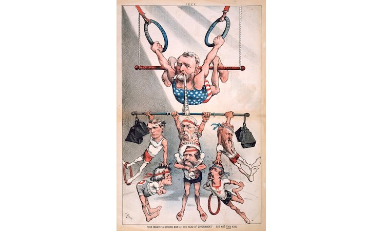
In the late nineteenth century, trade cards provided a means for advertisers to promote their products using vibrant images made possible by the recent rise of color lithography. These vivid cards became keepsakes, and were often collected and pasted into scrapbooks or albums. This trade card uses a comic strip format to advertise a beard dye designed to disguise signs of aging and make men appear more attractive. It is possible that illustrations like these were inspired by those found in comic newspapers like Puck magazine, which often featured figures with proportions like those pictured here (big heads, small bodies).
COUNTERLABEL
A glance at this trade card is all that the novice observer needs to understand that it has been remarkably preserved. While some minor staining on the reverse side indicates that it may have once been pasted in an album, the front of the card—which features vivid illustrations and a rather comic narrative about a greying beard—is almost totally pristine. Why might someone have wanted to save it? Perhaps it is due to its striking colors or distinct (and delightful) illustration style. As a copywriter, however, I am drawn to its narrative quality and winking tone of voice. That certain je ne sais quoi, paired with such lovely images, is what drew me to it initially. Maybe that’s true of the person who chose to preserve it, too—whoever they were.
While Harry’s never sold beard dye, the playful tone exhibited by my object (and by other trade cards advertising the same, like the one pictured here) struck me as fitting for the content. In the late nineteenth century, washing one’s hair was not common, but covering up greys was still a concern. As a result, dyes were popular products, but advertising cosmetics to men could be dicey. Men were expected to be tough, and caring too much about one’s appearance was a sign of weakness. It is possible that making light of the concerns that would lead a man to purchase a product like Buckingham’s Dye for the Whiskers might’ve eased some worries about seeming “too feminine” or “not manly enough.”
Image source: Library Company of Philadelphia
In viewing my object, I was somewhat surprised by how modern the format and illustration style seemed. I’d never seen a comic strip so old before, and I wondered as to how the artist who drew these characters might’ve developed what appeared to me to be a distinctive style featuring exaggerated poses and proportions. What I didn’t yet know was that humor magazines from the same era, such as the weekly Puck, often used cartoons rendered in a similar style to discuss politics and other social issues. Knowing that contemporary illustrators and art directors often troll Pinterest for inspiration, it would not surprise me if the person responsible for the images seen on this trade card had their own analog repository of “inspo” cut from magazines or other trade cards—but of course, that is purely speculative.
Image source: U.S. Senate
The surprising truth is that in piecing together the answers to my questions regarding this object, I have had to do a lot of speculation. Frustratingly, I have had to trust that my expertise in making similar objects—like, for example, this comic strip-style email I created with my colleague Amanda—would somehow translate to the work of my predecessors. While there is plenty of information out there about the first advertising agencies and copywriters and the importance of color lithography, there is not much about how the people involved in creating an object of this type would’ve worked together to produce the final version. My aim in my final project is thus to create a speculative guide for the nineteenth-century “creatives” involved in making ads, and to highlight the fictional additions necessary to complete the project to illuminate the gaps I’ve come across.
Image source: Harry’s
Podcast and Interview with Amanda
Hadley Leary
Creative Writing, Fiction / 2024
Hadley Leary is a fiction writer and student in the MFA Creative Writing program at Temple University. She is working on a campus novel set at her alma mater and a collection of linked short stories. She is also, sometimes, a copywriter.


