21.svg is more than just a thesis show. It's a state of mind. It's concept that represents the 4 of us as a group, each of us as individuals, and demonstrates how we collaborate. It highlights the uniqueness in our individual interests and skillsets. Furthermore, it's how we design together and it's a peek into our process. That is the 21.svg manifesto.
Because this year's MFA show was online rather than in-person, it was important to us that we developed an ✨unprecedented✨ brand and social media campaign for our exhibition. 21.svg was the culmination of our hard work at the end of our MFA program and we wanted to celebrate that. We are Kat Brissette, Justine Kelley, Wenqing Liu, and Marisa Watanabe. And we are 21.svg.
View our show on tylerdesignmfa.com/2021 or the @tylerdesignmfa Instagram
The main 21.svg logo works as a base for our overall branding. The star has 21 points, representing the year 2021, and our love for the rapper 21 Savage and the song "September" by Earth Wind and Fire.
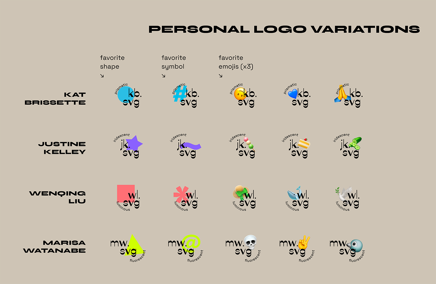
To highlight us as individuals, we established a system for variable logos. Each of us have logos that represent us, using our initials and variations based on our favorite shapes, symbols, and emojis.
In our palette, our primary colors were a sunshiny orange, shades of beige and a bold black. Our secondary colors represented each of us and were based on our favorite hues. These saturated, bright colors that stood out against the base colors in our brand.
Instagram was our social media of choice for marketing and showcasing ourselves, the brand, and everything in between. We posted teasers leading up to our website launch date, building anticipation and excitement.
With our interest in process, we decided to utilize Instagram to provide a sneak peak on how we developed our logo and branding.
We took inspiration from variety shows and the idea that the 21.svg squad is a cast of characters, and used Instagram as a way for our audience to get to know us better. It served as an outlet for us to goof off, do madlibs, fill out personality quizzes, and show our personalities.
The website took place of an in-person gallery exhibition. It featured 5 projects from each of us and our 2 group projects. We designed it to be salon-style, with all of our projects mixed together.
Each project has its own page for more information and insight. There is also a link to each of our personal portfolios which contain a more in-depth look into the project.
Of course, we wanted the audience to get to know us more in-depth, so we created profiles on each of us. The profiles included our artist statements, quirky fun facts, and even individual Spotify playlists of the music we've been vibing to recently.
Kat Brissette
Kat is a human-centered designer driven by empathy and compassion. She has a playful personality, loves coffee, tacos, and blue. When Kat isn’t designing, she’s probably with her family, on TikTok with her brothers, or volunteering in the community. She loves the city and finds peace by the ocean. From building apps to creating public awareness campaigns, Kat loves the flexibility and freedom of design. She takes a hands-on approach, finding creative ways to solve problems. Using her creativity and heart, she explores ways design can make an impact.
Justine Kelley
Justine is a Filipino-American, Philly-based designer and illustrator. Vibrant colors, human emotions, and mistakes that happen during the “making” process excite her and she loves to explore the intersection of art and design – to her, making art is to eating as designing is to cooking, and she likes to eat as she cooks. She also screen prints and makes ceramics (check her pots).
Wenqing Liu
Comes from Shenzhen, China, Wen is a visual designer focusing on UI/UX, typography, and 3d illustration. She tends to spend more time designing pleasing things(or making things pleasing) digitally and always starts somewhere near our life, this is why she starts working on experience design. She loves the place where it is broad and bright, so she makes her work desk near a window to have a view any time. Her favorite fruit is cherry and papaya! By the way, her MFA folks(we are 21.svg) think she is a designer-mind, creative and funny person.
Marisa Watanabe
Marisa is a half-Japanese/half-Chinese-Indonesian American Philly-based designer and self-proclaimed emo-poser. Though she was primarily print trained, her focus now lives in the digital realm where she likes to experiment with typography, layout, and media. Most of her interests are centered around the space between print and digital environments and the similar/different applications of design principles in both media spaces.
https://www.instagram.com/mawadoesthings/


